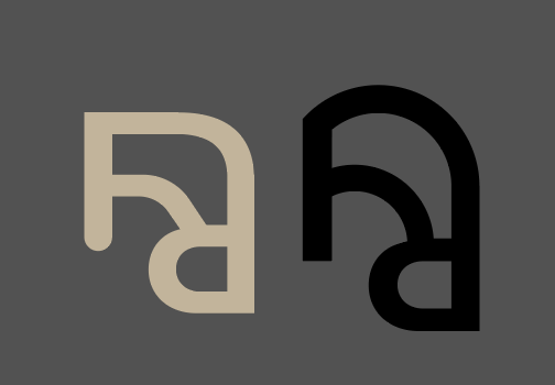
Starting out I tried to carry on with the square logo from Kristal’s earlier project pictured below.

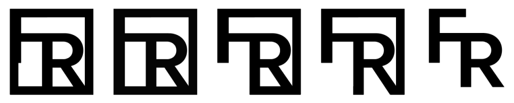
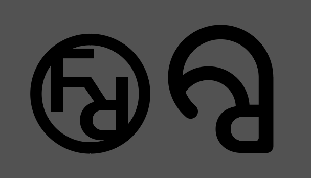
I liked the outcome but felt it was a bit rigid and structured, and I thought a circle would be more representative of the brands ethos, so I started to introduce some curves to the logo.
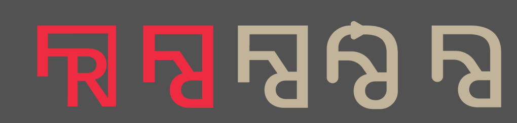
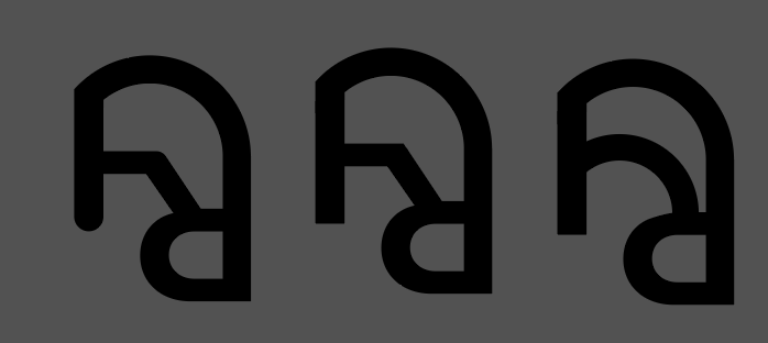
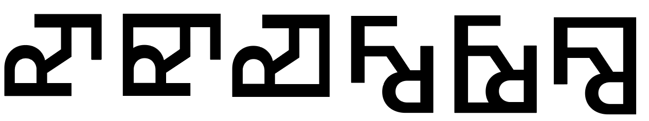
From here I still thought it was it but weak and would get lost at a small scale (like on the app) so we decided to fully embrace the circle.
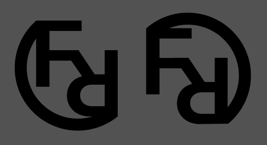
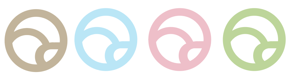
The final logo:
We settled on this logo, as the circle represents the circular nature of our business– and gives a softer feel (when compared to the earlier prototypes.) It is also reminiscent of care label symbols which is again fitting with the brand.
