Colour scheme
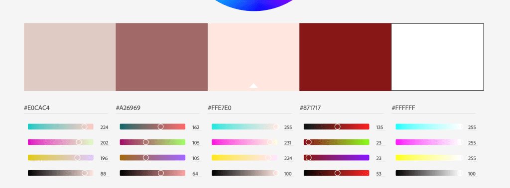
Our colour scheme was inspired by other applications targeting our target market. As we are looking at targeting a mainstream audience we need this to fit in with what these users like and are currently using.
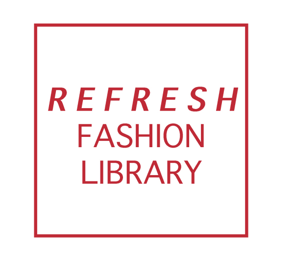
Logo

Our logo was designed to be simple and easily identifiable. To be able to represent the essence of our company without being to specific to being as clothing library as we plan for Refresh to grow beyond this.
- We wanted to create a logo that alluded to the essence our our business – helping make fashion a circular economy.
- Represents the online aspect of our business – looks similar to the icon you see as your page ‘refreshes’.
- Represent the cycle of our business – clothing going around and around.
- Also visually kind of looks like clothing in a washing machine.
Slogan
“Buy less, wear more.”
Catchy, clearly gets across one of the main selling points of our business.
